Enhancements

Four enhancements are submitted for assessment. Each one lists what it does, the code behind it, its technique source and a link to where it runs.

Advanced Responsive Design

One guide, every screen.

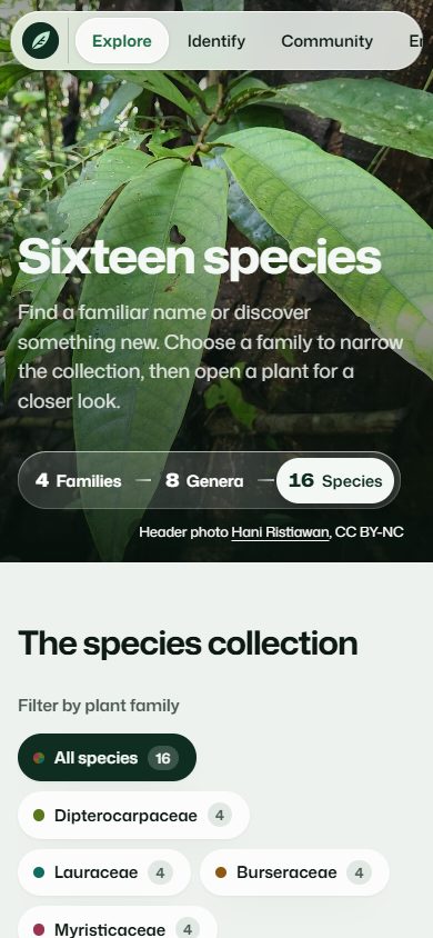
The species collection at phone width, with the glass menu as a scrolling capsule
The species collection at phone width Screenshot of this website; photographs in it are credited on the Sources page

What it does and who it helps

Photo grids regroup from asymmetric layouts to single columns. The floating glass menu becomes a sideways-scrolling capsule on phones, with the Profiles links joining the row. Floated sidebars stack, the taxonomy tree becomes an indented list, and wide tables scroll within their own frame.

How it works

Fluid clamp() type and spacing, intrinsic CSS Grid columns (auto-fill with minmax()) and Flexbox adapt the page without a breakpoint for every component. Four coordinated media queries (tablet, phone menu, phone and small phone) then restructure the menu, heroes, forms, asides and tile grids. display: contents lets the drop-down’s list items join the phone menu row.

Why it extends the basics

This combines coordinated navigation, form, image, table and sidebar behaviour; it goes beyond a single fluid width.

Key code

/* Species grid: 4 to 1 columns with no media query */
.species-grid {
    display: grid;
    grid-template-columns: repeat(auto-fill, minmax(min(100%, 16.5rem), 1fr));
}

/* Phones: the Profiles links join the scrolling menu row */
@media (max-width: 52em) {
    .dropdown-menu { display: contents; }
}

Technique reference: MDN Web Docs. Project-specific HTML and CSS were written for this site.

Responsive species collection

CSS-only Interactive Taxonomy Tree

Follow a branch from family to species.

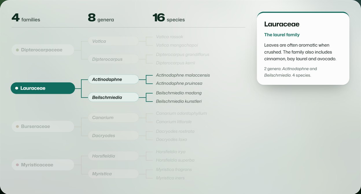
The taxonomy tree on the home page with the Lauraceae branch lit and the other families dimmed
The Lauraceae branch lit on the home page tree Screenshot of this website; photographs in it are credited on the Sources page

What it does and who it helps

The home page shows the whole collection as one tree: four families on the left, eight genera in the middle and sixteen species on the right, joined by coloured branch lines. Pointing at a family lights its branch, dims the other three and opens a glass card describing it; pointing at a genus or a species narrows the highlight further. Keyboard users get the same effect when Tab focus moves through the names, and every name links to its page.

How it works

The tree is ordinary nested <ul> lists, so it stays meaningful without CSS. Grid columns line the three levels up under their headings, and ::before and ::after pseudo-elements draw the branch lines. The relational selector :has() lets a parent react to the pointer or focus inside it: .tree:has(.tree-family:hover) dims every other family, and the same pattern works one level down for genera and species.

Why it extends the basics

It turns the site’s information architecture into an interactive diagram with no JavaScript, and it uses a selector (:has()) that goes well beyond the tutorials.

Key code

/* Dim every family except the one being explored */
.tree:has(.tree-family:is(:hover, :focus-within))
    .tree-family:not(:hover, :focus-within) {
    opacity: .22;
}

/* Show that family's glass card */
.tree-family:is(:hover, :focus-within) .tree-card {
    visibility: visible;
    opacity: 1;
}

Technique reference: MDN Web Docs. Project-specific HTML and CSS were written for this site.

Explore the tree on the home page

CSS-only Interactive Species Filter

A smaller collection, instantly.

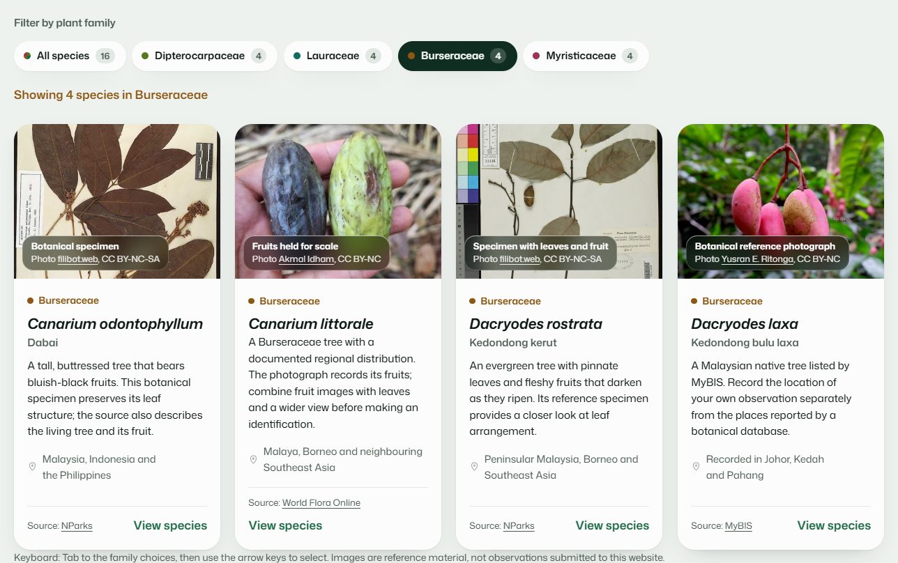
The species filter with Burseraceae chosen and only its four species showing
The filter showing only Burseraceae Screenshot of this website; photographs in it are credited on the Sources page

What it does and who it helps

Choose one family to show its four species, or All species to restore sixteen. The selected pill, its colour and the result count change together. Hidden cards leave the layout and keyboard order.

How it works

A native radio group supplies checked state and arrow-key behaviour. Explicit #family-name:checked general-sibling rules hide cards from other families and reveal the matching status message. Adjacent label selectors show selection and keyboard focus; CSS Grid arranges the remaining cards.

Why it extends the basics

This creates meaningful state and content filtering rather than a cosmetic hover effect. A short entrance animation is disabled for reduced-motion users.

Key code

/* Hide every card that is not in the chosen family */
#family-lauraceae:checked ~ .species-grid .plant-card:not(.lauraceae) {
    display: none;
}

/* The chosen family label becomes the filled pill */
.filter-input:checked + label {
    background-color: var(--btn-bg);
    color: var(--btn-ink);
}

Technique reference: MDN Web Docs. Project-specific HTML and CSS were written for this site.

Try the species filter

Advanced HTML5 Validation + CSS Form Feedback

Useful feedback at the right moment.

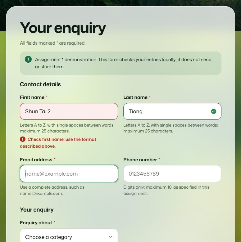
The enquiry form with an invalid first name highlighted and its error message shown
Error feedback on the enquiry form Screenshot of this website; photographs in it are credited on the Sources page

What it does and who it helps

Required fields, email formatting, name patterns and exact postcode length are checked by the browser. Labels and helpers explain the expected format. Error colours and messages appear after interaction rather than on first arrival, and valid fields receive a quiet confirmation tick.

How it works

required, maxlength, minlength, pattern and appropriate input types implement the constraints. :focus styles active editing; :user-invalid and :user-valid add post-interaction feedback. Native method="dialog" submission closes a non-modal dialog only after validation and reveals an honest local completion panel via a sibling selector.

Why it extends the basics

Several constraints, accessible guidance, non-colour error text and a privacy-preserving completion state work together. Neither persistence nor authentication is simulated.

Key code

<input id="postcode" type="text" pattern="[0-9]{5}"
       minlength="5" maxlength="5" required>

.form-group input:user-invalid ~ .field-error { display: block; }
.form-dialog[open] ~ .form-receipt { display: none; }

Technique reference: MDN Web Docs. Project-specific HTML and CSS were written for this site.

Test the enquiry form

Further techniques on this site

These also go beyond the tutorials but are not submitted for assessment; the four enhancements above are the ones to mark.

Liquid Glass materials and adaptive themes

The menu, buttons, photo captions and form sheets are translucent panes in the manner of Apple’s Liquid Glass (a web approximation: Apple publishes no CSS for it). backdrop-filter: blur() saturate() frosts what lies behind each pane and inset box-shadow layers draw its bright rim; large sheets sit on pre-blurred photographs so they look frosted without costly live blur. The home page title is filled with a frosted copy of the photograph using background-clip: text. Custom properties hold every colour, and prefers-color-scheme, prefers-reduced-transparency, prefers-contrast and prefers-reduced-motion redefine them.

.header-bar::before {
    background-color: var(--glass);
    box-shadow: var(--glass-rim), var(--glass-lift);
    backdrop-filter: var(--glass-blur);
}

Technique reference: MDN Web Docs.

See the glass menu and title

Sticky family chapters and glass specimen plates

On the home page each family chapter sticks below the menu with position: sticky while the next one slides over it, so scrolling reads as a stack of cards. On every species page the photograph is mounted like a specimen between two panes of glass and never enlarged beyond its original size.

.chapter {
    position: sticky;
    top: calc(6rem + var(--i) * 1.25rem);
}

Technique reference: MDN Web Docs.

Scroll the family chapters

Accessible CSS-only drop-down menu

The Profiles menu reveals each team member’s page on hover or when keyboard focus enters it, opening as a pane of frosted glass that springs from its top edge. :hover and :focus-within keep it open; on small screens the links join the menu row.

.nav-dropdown:focus-within .dropdown-menu {
    visibility: visible;
    opacity: 1;
}

Technique reference: MDN Web Docs.

Open the Profiles menu

Motion is always optional

Buttons and cards respond as soon as the pointer arrives; same-page links use smooth scrolling. On arrival the home page title materialises from a blur once, and page headings rise into place. The reduced-motion preference removes animations and smooth scrolling. Navigation remains ordinary HTML linking. Cross-document View Transitions and scroll-driven animations were intentionally omitted: the W3C CSS validator does not yet accept them, and Firefox does not run them by default.

Reference: MDN reduced-motion media query. Native form mechanism: MDN dialog element.